Mariusz (beta)

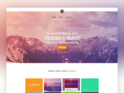

So I launched a quick beta of my personal portfolio page, currently it's mostly a placeholder with some information about me and a couple of Dribbble shots and I'm going to build this as I go.
Live version here. Real pixels attached.
So I launched a quick beta of my personal portfolio page, currently it's mostly a placeholder with some information about me and a couple of Dribbble shots and I'm going to build this as I go.
Live version here. Real pixels attached.


