7 Sins bar & restaurant logo typography final variations

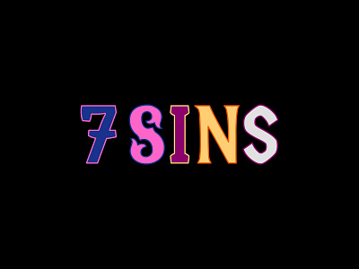
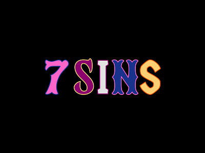
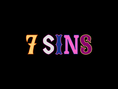
Final versions of the 7 Sins bar and restaurant logo.
As I've mentioned before the bar's unique selling point is the gamification of the space, with arcade games, shuffleboard and pool tables throughout the space.
To give the bar as a sense of "dark gamification" the brand has been styled around the idea of a carnival, with the typography itself being inspired by different carnivals from around the world that have been blended together into one space.
This final variations takes us away from solid colours, and starts introducing a vibrant mix of fill and stroke colours to really emphasise the idea of these letters being taken from different carnival spaces.
(Part of my work done at Persona Studio)


