Find designers
Designer search
Quickly find your next designer
Post a job
The #1 job board for design talent
Inspiration
Courses
UX Diploma
Learn UX design from scratch in 6 months
UI Certificate
12-week UI skill building for designers
Live interactive workshops
with design professionals
Jobs
Go Pro
Log in
Dribbble: the community for graphic design
Log in
Sign up
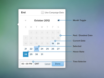
Combo Date Picker or Calendar - Different States
Prerak Patel
Follow
Following
Like
#8C9EB0
#F9F9FA
#71959A
#5B8E74
#446061
#56798E
#96AFD5
Download color palette
Rebound of
Date Picker / Calendar Wireframe
By
Prerak Patel
calendar
date
design
interface
ui
View all tags
Posted on Mar 15, 2013
1,658
7
21
2
View feedback
Prerak Patel
More by Prerak Patel
View profile
Previous
Next
Loading…