Find designers
Designer search
Quickly find your next designer
Post a job
The #1 job board for design talent
Inspiration
Courses
UX Diploma
Learn UX design from scratch in 6 months
UI Certificate
12-week UI skill building for designers
Live interactive workshops
with design professionals
Jobs
Go Pro
Log in
Dribbble: the community for graphic design
Log in
Sign up
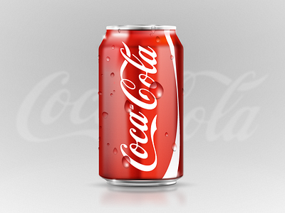
Coke Can Icon made in Fireworks
Fabio Benedetti
Available for work
Follow
Following
Like
Get in touch
#D5D5D5
#B5B4B4
#DD6760
#DC2B1B
#A51C16
#E39F9A
#9E534E
Download color palette
Coke icon made in Fireworks. 100% Vectors. Many hours. Feedback welcome.
100 vectors in fireworks
can icon
coca cola
coca cola can icon
coca cola icon
coca cola iconography
coke
coke can icon
coke icon
coke icons
cola
cola icon
droplets
fabio benedetti
fireworks
fireworks design
icon made in fireworks
shiny droplets
shiny icon
View all tags
Posted on Mar 15, 2013
6,339
3
202
31
View feedback
Fabio Benedetti
Welcome to my design portfolio on Dribbble
Get in touch
More by Fabio Benedetti
View profile
Previous
Next
Loading…
Loading…
Loading…