


Emnet branding - Selected Sketches - 2013.03.07
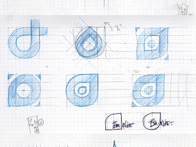

On the 3rd day, the client asked us to push the stylized water drop further, as well as investigate an option that would bridge the gap between the mark we were creating and their old/current branding. We tried to incorporate the triangles of the engineering symbol of the old brand in a few ways.


