Netflix Redesign Concept


One issue users are facing with streaming platforms, in general, is the huge amount of content. The more they offer, the more difficult it is to choose something to enjoy.
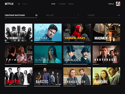
This concept is built on 3 key pillars:
- Continue watching
- My list
- Latest
We imagined having quick access to these before showing the full list of shows to the user while keeping the movie recommendations too. This should ease the choice.
What do you think of it?


