Find designers
Designer search
Quickly find your next designer
Post a job
The #1 job board for design talent
Inspiration
Courses
UX Diploma
Learn UX design from scratch in 6 months
UI Certificate
12-week UI skill building for designers
Live interactive workshops
with design professionals
Jobs
Go Pro
Log in
Dribbble: the community for graphic design
Advance your career with a Professional Diploma in UX Design
Learn more
Log in
Sign up
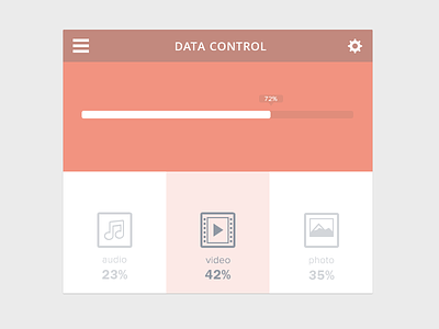
Data Control
Rovane Durso
Available for work
Follow
Following
Like
Get in touch
#F2EFEF
#F29380
#C4897E
#C3BFC3
#DFC0BA
#929AA4
Download color palette
see it @2x!
color
data
design
flat
music
photo
ui
video
widget
View all tags
Posted on Mar 9, 2013
12,050
48
282
12
View feedback
Rovane Durso
Crafting beautiful and functional websites and mobile apps
Get in touch
More by Rovane Durso
View profile
Previous
Next
Loading…
Loading…
Loading…