


Healthy Desserts - Interface Close-up

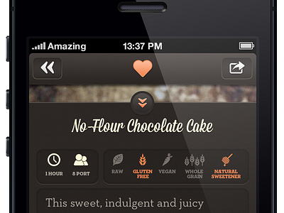

Icons and interface details for the iPhone version of Healthy Desserts. It was a bag of hurt to position the icons in Interface Builder without any visual reference, but i think it turned out OK. IB is an godforsaken tool that i wish Apple rewrite from scratch! Both designers and developers cry in despair. :)
More about Healthy Desserts:
http://www.greenktichenapps.com


