Find designers
Designer search
Quickly find your next designer
Post a job
The #1 job board for design talent
Inspiration
Courses
UX Diploma
Learn UX design from scratch in 6 months
UI Certificate
12-week UI skill building for designers
Live interactive workshops
with design professionals
Jobs
Go Pro
Log in
Dribbble: the community for graphic design
Log in
Sign up
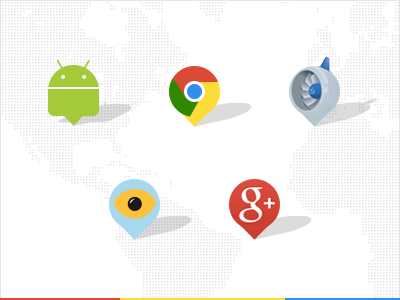
Google SXSW pins
ueno.
Follow
Following
Like
#FBFBFB
#AED1E2
#CBCC3B
#D74737
#ABA8A4
#347032
#418EDC
Download color palette
Some special map pins made for the Google part of last years SXSW.
android
app engine
chrome
engine
eye
google
google plus
map
pins
sxsw
View all tags
Posted on Mar 8, 2013
13,378
15
227
9
View feedback
ueno.
We make nice things with you.
More by ueno.
View profile
Previous
Next
Loading…