Find designers
Designer search
Quickly find your next designer
Post a job
The #1 job board for design talent
Inspiration
Courses
UX Diploma
Learn UX design from scratch in 6 months
UI Certificate
12-week UI skill building for designers
Live interactive workshops
with design professionals
Jobs
Go Pro
Log in
Dribbble: the community for graphic design
Log in
Sign up
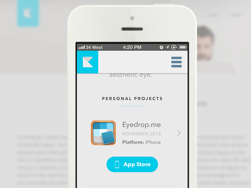
Mobile profile
Kerem Suer
Available for work
Follow
Following
Like
Get in touch
#E2E2E1
#CEBEB4
#93D6E2
#10C0DF
#5D5D5D
#1E1D1D
#A29F9D
#BF8D61
Download color palette
I'm alive.
clean
css3
design
foundation
html
html5
minimal
minimus
mobile
papercraft
responsive
teal
web
View all tags
Posted on Mar 8, 2013
73,085
118
885
31
View feedback
Kerem Suer
Welcome to my design portfolio on Dribbble
Get in touch
More by Kerem Suer
View profile
Previous
Next
Loading…
Loading…
Loading…