Creative Status Single Page Site

1 Attachment

14 Responses

  1. Pro Blaz Robar Blaz Robar

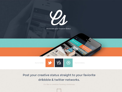
    Working on the single pager to showcase the Creative Status web app! Small note* Not sure we can do the posting to dribble functionality yet!

    likes

    3 months ago

  2. Pro Luke Etheridge Luke Etheridge

    This is nice - love the top section and the presentation of the iPhone.

    I think maybe the social buttons could do with being slightly closer to their branded colours. I'm not saying their exact brand colors because I understand you don't want to ruin the scheme of the site, but maybe the right color but in a shade that suits? Even flipping them would get you closer (Dribbble orange and Twitter green). Hope that makes sense...

    likes

    3 months ago

  3. Pro Blaz Robar Blaz Robar

    @Luke Etheridge yeh know what you mean - it feels odd seeing those iconic icons on a different colored background!

    likes

    3 months ago

  4. Pro Enzo Li Volti Enzo Li Volti

    I agree with @Luke Etheridge.
    PS: you've wrote "faviorite" instead of favorite :)

    likes

    3 months ago

  5. Andrey S. Rodrigues ☝ Andrey S. Rodrigues ☝

    great work bro :)

    3 months ago

  6. Bruno Rodrigues Bruno Rodrigues

    very good!

    3 months ago

  7. Matt Bilbow Matt Bilbow

    Love this, however the top section feels a bit inception, I end up staring at whats on the phone within a phone.

    3 months ago

  8. Emil Manolea Emil Manolea

    Love the colors. Great work!

    3 months ago

  9. Pro Matt Kump? Matt Kump?

    Sharp brand! I think the 2 phones at different-yet-similar angles so close to each other is a bit off, but looks appealing otherwise.

    I see you've gone back to the Cs logo. Shame… I thought the other one was a much stronger mark for identification purposes.

    likes

    3 months ago

  10. Pro Charlie Waite Charlie Waite

    I agree with @Matt Kump? about the 2 phones being really close.

    Also I think the two bands of color are a bit distracting. Maybe use the dk background with the faded out phone and save the real phone/real screen for somewhere lower on the site. Either way it's looking good, can't wait to see the finish product.

    3 months ago

  11. Pro Ala Dadan Ala Dadan

    awesome!

    3 months ago

  12. Pro Virgil Pana Virgil Pana

    I agree with @Matt Bilbow about the top section that looks unfinished, great color scheme overall.

    3 months ago

  13. Pro Paula Borowska Paula Borowska

    All of your shots are amazing =] I love the way you use colour

    3 months ago

  14. Pro Greg Christian Greg Christian

    @Blaz Robar similar project going on over here. yeah!

    likes

    18 days ago

keyboard shortcuts: previous shot next shot L or F like