The New York Times App Redesign

This is a concept app for the challenge on Uplabs
demo URL: https://youtu.be/zyOzx5i9qqA https://www.uplabs.com/posts/the-new-york-times-app-redesign
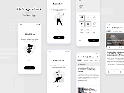
I did a redesign after studying the existing New York Times app. I liked the monochromatic scheme of the app where everything is black & white with bold emphasis on headlines. However I felt the lack of transition between the pages and a monotonous onboarding experience. so I have added some simple transition on splash screen, user onboarding screens and image transformation to make it more visually appealing and playful.
If you like it then please don't forget to upvote.
Credits ~ Illustration: drawkit.io ~ icons: JamIcons (iconclub)


