


bountie

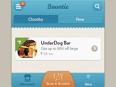


I think people hate renders now so posting elements of an app i'm working on. Bigger shots are attached.
Feedback would be appreciated.
I think people hate renders now so posting elements of an app i'm working on. Bigger shots are attached.
Feedback would be appreciated.


