Find designers
Designer search
Quickly find your next designer
Post a job
The #1 job board for design talent
Inspiration
Courses
UX Diploma
Learn UX design from scratch in 6 months
UI Certificate
12-week UI skill building for designers
Live interactive workshops
with design professionals
Jobs
Go Pro
Log in
Dribbble: the community for graphic design
Log in
Sign up
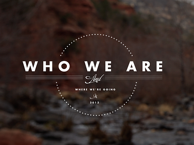
Discovery Interior Sections, numero dos...
Caleb Royce Lummer
Follow
Following
Like
#2E211D
#413F41
#FCFCFB
#867B79
#9A9391
Download color palette
Last one, I promise...
american
ampersand
anvil
blue
canyon
design
didot
flag
futura
layout
logo
navigation
orange
script
transparency
type
ux
website
white
View all tags
Posted on Mar 5, 2013
13,062
26
238
17
View feedback
Caleb Royce Lummer
Dribbble
More by Caleb Royce Lummer
View profile
Previous
Next
Loading…