Find designers
Designer search
Quickly find your next designer
Post a job
The #1 job board for design talent
Inspiration
Courses
UX Diploma
Learn UX design from scratch in 6 months
UI Certificate
12-week UI skill building for designers
Live interactive workshops
with design professionals
Jobs
Go Pro
Log in
Dribbble: the community for graphic design
Log in
Sign up
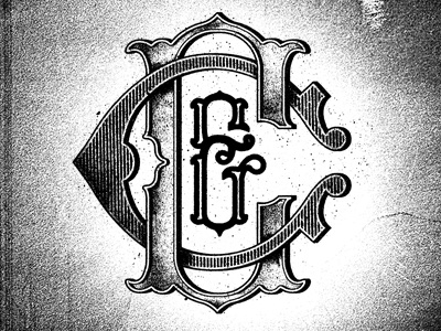
C and C 2
Two Arms Inc.
Follow
Following
Like
#EEEEEE
#A1A1A1
#121212
#626262
Download color palette
Adjusted monogram design.
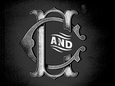
Rebound of
C and C
By
Two Arms Inc.
lettering
monogram
texture
View all tags
Posted on Mar 5, 2013
3,239
18
154
17
View feedback
Two Arms Inc.
More by Two Arms Inc.
View profile
Previous
Next
Loading…