Find designers
Designer search
Quickly find your next designer
Post a job
The #1 job board for design talent
Inspiration
Courses
UX Diploma
Learn UX design from scratch in 6 months
UI Certificate
12-week UI skill building for designers
Live interactive workshops
with design professionals
Jobs
Go Pro
Log in
Dribbble: the community for graphic design
Log in
Sign up
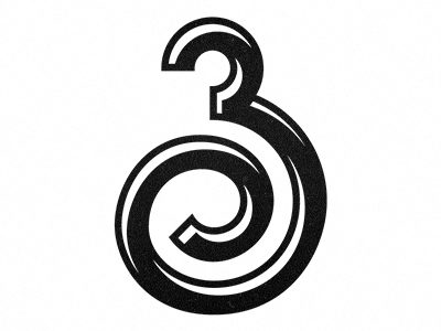
3 take 2
Michael Spitz
Available for work
Follow
Following
Like
Get in touch
#FEFEFE
#161616
#5F5F5F
#9F9F9F
Download color palette
Down to the final stretch...
Rebound of
3
By
Michael Spitz
3
black and white
collab
curl
custom type
digit
highlights
lettering
numbers
print
shading
three
type
typography
View all tags
Posted on Mar 5, 2013
4,537
7
141
4
View feedback
Michael Spitz
Welcome to my design portfolio on Dribbble
Get in touch
More by Michael Spitz
View profile
Previous
Next
Loading…
Loading…
Loading…