Find designers
Designer search
Quickly find your next designer
Post a job
The #1 job board for design talent
Inspiration
Courses
UX Diploma
Learn UX design from scratch in 6 months
UI Certificate
12-week UI skill building for designers
Live interactive workshops
with design professionals
Jobs
Go Pro
Log in
Dribbble: the community for graphic design
Log in
Sign up
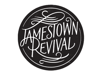
Jamestown Revival
Simon Walker
Available for work
Follow
Following
Like
Get in touch
#FEFEFE
#221F1F
#403E3F
#C0BFC0
#A09FA0
#5F5E5F
Download color palette
Logo for
these guys.
Posted on Mar 5, 2013
4,351
25
298
31
View feedback
Simon Walker
Get in touch
More by Simon Walker
View profile
Previous
Next
Loading…
Loading…
Loading…