Find designers
Designer search
Quickly find your next designer
Post a job
The #1 job board for design talent
Inspiration
Courses
UX Diploma
Learn UX design from scratch in 6 months
UI Certificate
12-week UI skill building for designers
Live interactive workshops
with design professionals
Jobs
Go Pro
Log in
Dribbble: the community for graphic design
Log in
Sign up
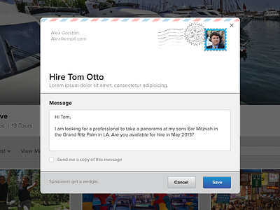
"Hire a Pro" Modal 2
Fedor Sosnin
Follow
Following
Like
#F5F5F6
#575657
#222427
#211A12
#B2AEB1
#3981B9
Download color palette
Testing a toned down version.
envelope
hire a pro
mail
modal
pano
pop up
pro
send
team disruptive
View all tags
Posted on Mar 5, 2013
699
0
11
3
View feedback
Fedor Sosnin
More by Fedor Sosnin
View profile
Previous
Next
Loading…