Find designers
Designer search
Quickly find your next designer
Post a job
The #1 job board for design talent
Inspiration
Courses
UX Diploma
Learn UX design from scratch in 6 months
UI Certificate
12-week UI skill building for designers
Live interactive workshops
with design professionals
Jobs
Go Pro
Log in
Dribbble: the community for graphic design
Log in
Sign up
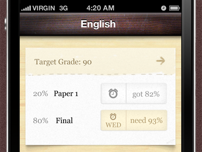
Grades 2 Preview
Jeremy Olson
Follow
Following
Like
#F8F6EE
#110F0E
#EDDDB2
#503635
#615251
#AFA89A
#94836D
Download color palette
Refining the look and feel of Grades 2.
app
ios
iphone
paper
shadow
ui
wood
View all tags
Posted on Jan 8, 2011
3,010
4
42
6
View feedback
Jeremy Olson
More by Jeremy Olson
View profile
Previous
Next
Loading…