New icons for the sidebar !

21 Responses

  1. Pro Tommy Roussel Tommy Roussel

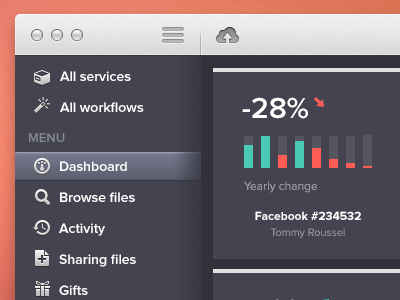
    Following your feedback I decided to change the style icons of the sidebar.

    What do you think ?

    More on http://www.sush.io

    3 months ago

  2. Pro Aran Bansal Aran Bansal

    Looking great Tommy and I definitely prefer these icons!

    likes

    3 months ago

  3. Pro Tommy Roussel Tommy Roussel

    Thanks dude ;) @Aran Bansal

    3 months ago

  4. Andrey S. Rodrigues ☝ Andrey S. Rodrigues ☝

    much better, but I think the inner shadow on the right is not cool

    likes

    3 months ago

  5. Pro Alexander Zaytsev Alexander Zaytsev

    Look awesome :-)

    likes

    3 months ago

  6. Pro Tommy Roussel Tommy Roussel

    @Andrey S. Rodrigues Thanks for the feedback but the "inner shadow" is when the menu is expanded. When the menu is folded, the shadow disappears ...

    @Alexander Zaytsev thanks ;)

    3 months ago

  7. Jona Jona

    Looks a lot more clean and consistent indeed. Great work!

    likes

    3 months ago

  8. Pro Roberto Torres Roberto Torres

    Much better!

    likes

    3 months ago

  9. Pro COBE COBE

    great work @Tommy Roussel

    likes

    3 months ago

  10. Pro Avinash Tripathi Avinash Tripathi

    crispy

    likes

    3 months ago

  11. Pro Julia Khusainova Julia Khusainova

    Nice use of colors!

    likes

    3 months ago

  12. Pro Dan Flynn Dan Flynn

    Like these b/w icons more than the colored ones. You could try making them all the same hue such as the bright green you used elsewhere. Nice work!

    likes

    3 months ago

  13. Lee Giles Lee Giles

    Love this

    likes

    3 months ago

  14. just say panda just say panda

    Keeping the icons all the same color works a lot better in my opinion. Loving the color palette.

    likes

    3 months ago

  15. Pro Jeff Kent Jeff Kent

    Man, this looks great!

    likes

    3 months ago

  16. Pro ModernBits ModernBits

    These icons work so much better with the interface than the previous ones. They match with the theme, but are not trying to be the focus of attention as the other ones were.

    likes

    3 months ago

  17. Pro Tommy Roussel Tommy Roussel

    Thanksssssssss ;) @Roberto Torres @COBE @Avinash Tripathi @Julia Khusainova @Lee Giles @just say panda @Jeff Kent

    @Dan Flynn Thanks for the feedback ;) You're right, i'll try it...

    @CreativeDraft ;)

    3 months ago

  18. Redsan Redsan

    Impatient de tester l'outil!
    Belle idée et belle carrosserie ;)

    likes

    3 months ago

  19. Pro Tommy Roussel Tommy Roussel

    Merci @Redsan ;)
    Ça arrive prochainement...!

    3 months ago

  20. Daniel Mawdsley Daniel Mawdsley

    love the choice of colours! looks great

    likes

    27 days ago

  21. Pro Manas Vaze Manas Vaze

    love the style and colors! yum!

    likes

    24 days ago

keyboard shortcuts: previous shot next shot L or F like