SOC Dashboard

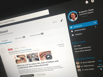
Dashboard concept page for medical search database. This view would display once you login and see the topics/questions that you are following.
Thanks, let me know what you think.
Dashboard concept page for medical search database. This view would display once you login and see the topics/questions that you are following.
Thanks, let me know what you think.


