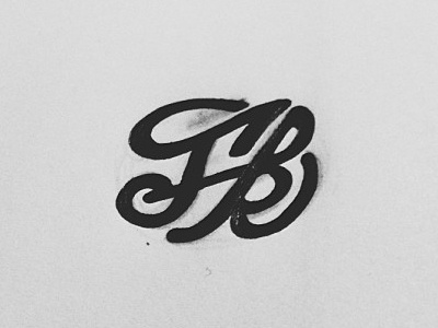
monogram
I have been working on a monogram for the brand and I like the "f"...but that "k" is so pesky lol maybe if I close the gap some more so it doesn't resemble a "b" so much. feedback appreciated, thanks.
View all tags
Posted on
Mar 5, 2013
More by Joonbug View profile
Like


