This direction was however not used. You should check out the case study for the Google Drive project on my portfolio to see more versions of this and other parts of the project.
-----
Made with Upperquad who are amazingly enough hiring. Don't miss out on this fantastic opportunity to work with us on making the world a prettier place, one pixel at a time :)
@Michael Aguiar designed for Google yes, but this direction was not used.
@Chris Meeks the idea was that these two were partly connected. Which is why it doesn't "end" with a rounded corner. But I do get your point.
@Chris Lüders I use a vertical grid. But I usually don't use a horizontal typographic grid (which I assume is what you are asking about).
@Michael Topschij and @Luke Etheridge To each their own. I use Google Drive and I think it's fantastic. But this is not really the place to compare products :)
17 Responses
Pro
Haraldur Thorleifsson
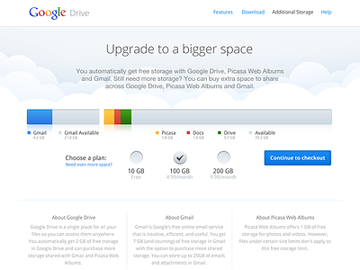
A part of a purchase flow where users can upgrade their storage capacity for Google Drive. Don't miss the full view in the attachment.
This direction was however not used. You should check out the case study for the Google Drive project on my portfolio to see more versions of this and other parts of the project.
-----
Made with Upperquad who are amazingly enough hiring. Don't miss out on this fantastic opportunity to work with us on making the world a prettier place, one pixel at a time :)
3 months ago
Wow looks Awesome. Great Job.
3 months ago
Pro
Matej Latin
great job man... I laso love the balck bg version...awesome
3 months ago
Pro
Chris Meeks
Looks great! Should the right-side of the gray Gmail box be rounded? It looks weirdly cut-off to me.
3 months ago
Pro
Kartik Mahant
Wallah!!!
3 months ago
Pro
Max Yerohov
Very clean!
3 months ago
Pro
Josh Martin
Nice!
3 months ago
Is this official work for Google? Looks great!
3 months ago
Pro
Chris Lüders
Do you work with a baseline grid, for the typo?
3 months ago
Pro
Luke Etheridge
This is very nice mate. Good work!
Agree with @Michael though - Dropbox is the shit!
3 months ago
Pro
Haraldur Thorleifsson
@Michael Aguiar designed for Google yes, but this direction was not used.
@Chris Meeks the idea was that these two were partly connected. Which is why it doesn't "end" with a rounded corner. But I do get your point.
@Chris Lüders I use a vertical grid. But I usually don't use a horizontal typographic grid (which I assume is what you are asking about).
@Michael Topschij and @Luke Etheridge To each their own. I use Google Drive and I think it's fantastic. But this is not really the place to compare products :)
3 months ago
Pro
Bhushan Bhatt
Good work! it really insuperable for me @Haraldur Thorleifsson
3 months ago
Pro
Salto
Your works rock's!
3 months ago
Pro
Chris Lüders
@Haraldur Thorleifsson Yep, i meant that. Thanks for your answer. I Love to use a 6px horizontal grid, for the typo
3 months ago
This looks amazing!
3 months ago
@Haraldur Thorleifsson Man, this looks better then their current site. Great work regardless!
3 months ago
I wonder what the type at the bottom would look like with more white space, larger margins and more breathing room?
I mean, the graphics above are spot on, but it feels like everything below it is jammed in to be above the fold or something. Great work!
28 days ago