Article Preview on Homepage

11 Responses

  1. Pro Waseem Arshad Waseem Arshad

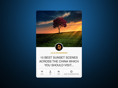
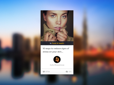
    another view for a social network I am working on.

    @2X for non retina users

    See attachment for hover state.

    3 months ago

  2. Pro Ionut Zamfir Ionut Zamfir

    @Waseem Arshad Awesome stuff, bro :)

    likes

    3 months ago

  3. Pro Kevin Cdnc Kevin Cdnc

    +1 really nice work

    likes

    3 months ago

  4. Pro Avinash Tripathi Avinash Tripathi

    nice!!

    3 months ago

  5. Connor Gaughan Connor Gaughan

    The blue heart for the "Likes" portion falls a little flat next to the hover color of the headline. Over all it looks nice.

    likes

    3 months ago

  6. Pro Tanvir ahmed fahim Tanvir ahmed fahim

    simple , clean & highly focused ..... i like it very much . nice work bro .

    likes

    3 months ago

  7. Pro Jason Lenker Jason Lenker

    Super clean. Maybe just a smidge bigger on the user circle. My 2ยข. Great though.

    likes

    3 months ago

  8. Pro Waseem Arshad Waseem Arshad

    likes

    3 months ago

  9. Pro harwen harwen

    Nice

    likes

    3 months ago

  10. Rob Marshall Rob Marshall

    Very clean, Waseem. Like it. :)

    Just a little suggestion, maybe you could buy back a few pixels for the "Add Suggestion" tab by tightening up slightly on the others. It looks a tiny bit cramped to me, that's all. :)

    3 months ago

  11. Pro Waseem Arshad Waseem Arshad

    @Rob Marshall thanks buddy, I agree with you..

    likes

    3 months ago

keyboard shortcuts: previous shot next shot L or F like