iPhone / Web UI Coming

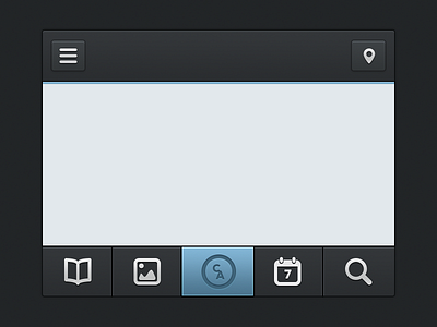

Working on a web UI actually, removed the logo for now.
Would love some feed back actually. Haven't done something like this in a while :)
Make sure you check the @2x version
Working on a web UI actually, removed the logo for now.
Would love some feed back actually. Haven't done something like this in a while :)
Make sure you check the @2x version


