New Logo for One Bright Light

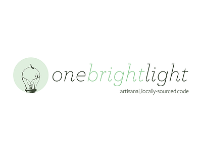
Trying out a new logo that is pretty much an evolution of my original logo. I’ve always been a fan of vintage bulbs and their filaments, so using a classic illustration seemed like a natural evolution. The color scheme isn’t where I’d like it to be yet, but it’s getting there.
I’m not necessarily satisfied with the artwork for the bulb and will likely revise it from other reference images soon.
The tagline at the bottom is somewhat of a humorous nod to the San Francisco and West Coast lifestyle that I’m surrounded by. Everything here seems to have a focus on being artisanal, locally-sourced and bespoke product. While I don’t think that’s necessarily a bad thing for most products, I thought it was somewhat humorous to add the tagline as technically, writing code in a text editor and being your own developer means that the code would be artisanal and locally-sourced. Hence the nod.


