Find designers
Designer search
Quickly find your next designer
Post a job
The #1 job board for design talent
Inspiration
Courses
UX Diploma
Learn UX design from scratch in 6 months
UI Certificate
12-week UI skill building for designers
Live interactive workshops
with design professionals
Jobs
Go Pro
Log in
Dribbble: the community for graphic design
Advance your career with a Professional Diploma in UX Design
Learn more
Log in
Sign up
Other
JC Desevre
Available for work
Follow
Following
Like
Get in touch
#EADBAD
#F5EAC7
#C6B08D
#BF685C
#728A64
#969B83
#61714F
Download color palette
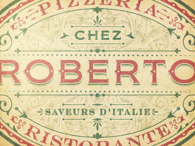
Other proposal, more classic, more italian.
design
emblem
graphic
illustrator
jcdesevre
logo
logo design
logo designer
vector
View all tags
Posted on Mar 1, 2013
4,772
17
157
13
View feedback
JC Desevre
Get in touch
More by JC Desevre
View profile
Previous
Next
Loading…
Loading…