climbing project

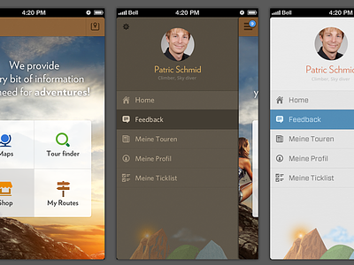


A little adventure project i've been working on. There're two color schemes for the list menu i've come up with.
-white
-brown
which one of them do you think looks good? Also what position for setting icon you like most right or left? Do you think the bottom artwork fits well there?
Edit: Added rocks-artwork


