Element Wave Brands

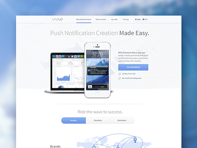
Here's some more content from the Element Wave marketing site we're creating. Keep an eye out for shots of the rest of the site and the dashboard!
Here's some more content from the Element Wave marketing site we're creating. Keep an eye out for shots of the rest of the site and the dashboard!


