Skontu EP music alt album cover

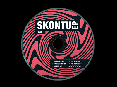
This is the second part of the Ayit Skontu EP project. Showcased here is an alternative album cover, the bandcamp page design, stickers and social posts that I was creating before and during the EP launch. For everyone that is not familiar with the Skontu EP project, here is some background info:
My friend @ayitdj asked me to help him out with his first EP. "Skontu" is a Slovenian word for "figured it out". Ayit went through many ups and downs while creating this EP and my mission was to capture and illustrate the sounds and feelings of these tracks. I created the entire graphical system that consists of geometry elements, bold typography and pink swirls. Bold typography communicates the brutal night club setting. Pink swirls, on the other hand, illustrate the variety of emotions captured in this EP. The geometry sequence, resembling the golden ratio represents growth; how something small can grow bigger over time. It also connects all the elements together and makes the graphical composition even more raw.


