New design for my personal site

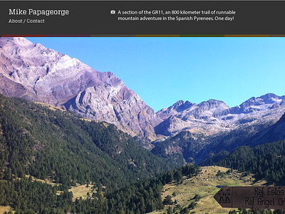
I've been playing around with a resizable full screen image on my homepage. Its live at the moment and the code has been hacked together, and I'm looking to make it more appealing and to have it work better on phone sized devices.
(For this screenshot I moved that image caption over to get it in the shot. That's me being a Dribbble rookie, but the caption will align nicely to the right).
Anyways, I've been dying to use an Egyptienne-like slab-serif for years, and am thinking to use Adelle via typekit for this design (the screenshot uses Vitesse).
There's not much design to it at the moment; iterations from here will try and do something more creative with my name (or not) and something different with the navigation (or not).
Designer personal sites. A never ending journey!


