I like how minimal it is. There is a clear message in the window, and I know exactly what the button does. I'm not really a fan of the greens used. The bright turquoise green is a tad shocking and doesn't quite sit with the lime green. I think complementary colors might be better than analogous colors in this situation.
It's a really simple change to make, you'll be on your way in no time!
I think you are right, I just used that color and thats why I used it, now that you mentioned it, it feels like the button should be lime like or some basic color like red/blue.
I'm working on a web app for a company here in NYC, Ill need some feedback on the colors when I move into the design in about a week, I will post some of the elements and would love your feedback on it !
3 Responses
Pro
Pierre Klein
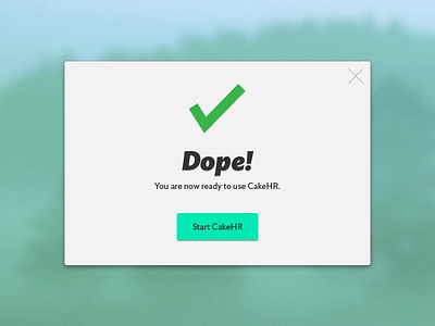
Almost flat version with a little bit a drop shadow.
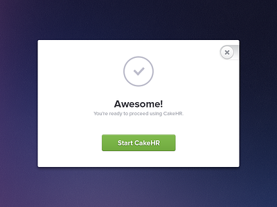
3 months ago
Pro
Cole Townsend
I like how minimal it is. There is a clear message in the window, and I know exactly what the button does. I'm not really a fan of the greens used. The bright turquoise green is a tad shocking and doesn't quite sit with the lime green. I think complementary colors might be better than analogous colors in this situation.
It's a really simple change to make, you'll be on your way in no time!
3 months ago
Pro
Pierre Klein
Thanks Cole !
I think you are right, I just used that color and thats why I used it, now that you mentioned it, it feels like the button should be lime like or some basic color like red/blue.
I'm working on a web app for a company here in NYC, Ill need some feedback on the colors when I move into the design in about a week, I will post some of the elements and would love your feedback on it !
3 months ago