CTA Group Re-branding - Concept Proposals

10 Responses

  1. Pro Emir Ayouni Emir Ayouni

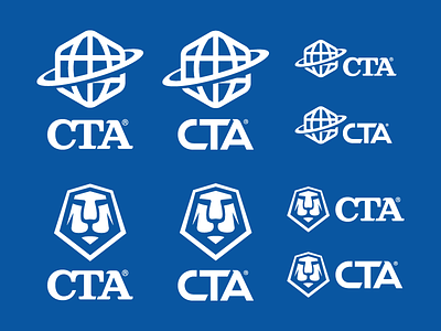
    We're currently working on a re-branding for The CTA Group.
    A belgian logistics company that mainly work with supplying mining equipment to African countries.

    Sent these over to the client today.

    Logo marks by me.
    Word marks by Simon Ă…lander.

    likes

    3 months ago

  2. Pro Miramark Diaz Miramark Diaz

    inspiring work. :)

    3 months ago

  3. Pro Joe Nicklo Joe Nicklo

    I really like the Serif version. Top left is my favorite. The lion looks awkward without his mane.

    3 months ago

  4. Pro Luis Lopez Grueiro Luis Lopez Grueiro

    Agree with Joe that serif version looks so cool!!

    3 months ago

  5. Pro Milosz Klimek Milosz Klimek

    Looks like a good collabo, cuz the combo of these two looks sweet.

    3 months ago

  6. Pro Simon H. Simon H.

    The serif versions looks amazing. Nice work @Emir Ayouni and @Simon Ă…lander. If there's a chance to collaborate with you in the future, don't hesitate to get in touch.

    3 months ago

  7. Cameron Lloyd Cameron Lloyd

    I was also thinking serif version until I read what the actual company did and now I like the bottom right for sure. That world mark is too cliche for me and I love the modern-es of the lion and that font..I think it calls out mining...and I think their clients will like it too..

    3 months ago

  8. Pro Dangerdom Dangerdom

    Nice! Digging that sans type.

    3 months ago

  9. Pro Nathan Li Nathan Li

    The 'A' looks nice.

    3 months ago

  10. 3 months ago

keyboard shortcuts: previous shot next shot L or F like