Find designers
Designer search
Quickly find your next designer
Post a job
The #1 job board for design talent
Inspiration
Courses
UX Diploma
Learn UX design from scratch in 6 months
UI Certificate
12-week UI skill building for designers
Live interactive workshops
with design professionals
Jobs
Go Pro
Log in
Dribbble: the community for graphic design
👀 BIG news from Dribbble...
check out our blog for details!
Log in
Sign up
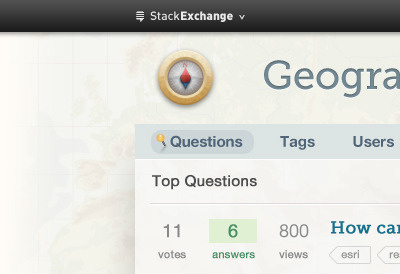
Gis
Jin Yang
Follow
Following
Like
#F0F1EC
#CBC7B3
#2C2C2C
#4D4F50
#708993
#A5A8A5
#BF9D65
Download color palette
Posted on Jan 5, 2011
3,115
3
37
6
View feedback
Jin Yang
More by Jin Yang
View profile
Previous
Next
Loading…