3D Text w/ Just CSS

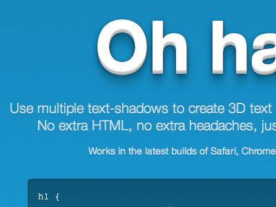
Throwing together a little demo for a quick blog post about text-shadows. Should go live tomorrow with a teeny tiny Easter egg.
Throwing together a little demo for a quick blog post about text-shadows. Should go live tomorrow with a teeny tiny Easter egg.


