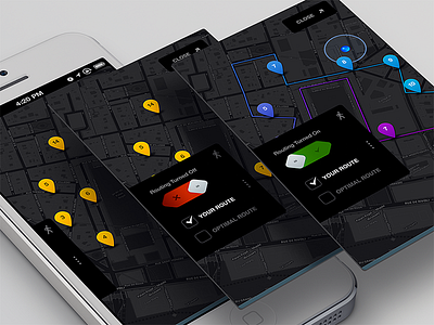
@Elastika Interesting. I've never played or heard of them. Yet more proof that people often think alike. The last time I played a video game was when I was 15 and owned a Nintendo 64 before it got stolen. Games -> ain't nobody got time for that! :P
Right now I think the map seems to be very blackout so user wont be able to see the location names which is not good in my opinion if this is map app user be able to see the locations name clearly on map.. Other than that this is awesomeness :)
@Paresh Khatri ::::✈ Thanks for the feedback! Have you been able to check out the real pixels on a retina screen yet? The map is easier to read on the phone as the contrast is better, but point well noted.
@Rally Interactive (via Ben Cline) yeah I did check the real pixels but not on ratina screen as I dont have one :( but if you could make it a bit lighter it will be spot on :) but I really love all your work so.....
These look awesome. One thought: should the on/off be flipped? The default switches on iOS are opposite of what you have. Might introduce a little confusion. Also might prevent an accidental turning the switch on when I meant to close the drawer depending on where the touch points fall.
Killer work Ben. Ever since I saw the black map in Square's NY Taxi app, I've wanted to see more like it. OpenMaps and maybe Mapbox seem like good options for a map like that, although I'm sure you guys have looked into ways to do it. Good luck with this!
Bold choice for button shapes...was it lead by some theme/branding element? Just want to know the thought process of 'why' that particular shape or how it ties into the rest of the product.
Also almost share the same concern as @Paresh Khatri ::::✈ coz i know from personal experience, that dark theme can be really slick but can be a trouble maker.
Just nit picking, I am loving the style and direction its heading towards. Kewl Stuff as always.
18 Responses
*Update*:City Guides, a product by National Geographic and Rally Interactive is now live in the App Store.
*Download the iPhone app*: https://itunes.apple.com/us/app/city-guides-by-national-geographic/id592453480?ls=1&mt=8
Mapping a route. Progression on the 'Secret Project'.
Also, check out the attached real pixels.
Huge thanks to @Mikael Eidenberg for the the render template PSD
4 months ago
It's very similar project to some games of Place Challange.
4 months ago
@Elastika Interesting. I've never played or heard of them. Yet more proof that people often think alike. The last time I played a video game was when I was 15 and owned a Nintendo 64 before it got stolen. Games -> ain't nobody got time for that! :P
4 months ago
Looking good Ben!
4 months ago
Right now I think the map seems to be very blackout so user wont be able to see the location names which is not good in my opinion if this is map app user be able to see the locations name clearly on map.. Other than that this is awesomeness :)
4 months ago
@Paresh Khatri ::::✈ Thanks for the feedback! Have you been able to check out the real pixels on a retina screen yet? The map is easier to read on the phone as the contrast is better, but point well noted.
4 months ago
@Rally Interactive (via Ben Cline) yeah I did check the real pixels but not on ratina screen as I dont have one :( but if you could make it a bit lighter it will be spot on :) but I really love all your work so.....
4 months ago
@Paresh Khatri ::::✈ I agree. I will try and lighten it up a bit more as it gets closer to launch :)
4 months ago
Amazing!
4 months ago
Really nice work guys, loving the unique ON/OFF Switch.
4 months ago
These look awesome. One thought: should the on/off be flipped? The default switches on iOS are opposite of what you have. Might introduce a little confusion. Also might prevent an accidental turning the switch on when I meant to close the drawer depending on where the touch points fall.
4 months ago
This is amazingly good !!! Incredible
4 months ago
Killer work Ben. Ever since I saw the black map in Square's NY Taxi app, I've wanted to see more like it. OpenMaps and maybe Mapbox seem like good options for a map like that, although I'm sure you guys have looked into ways to do it. Good luck with this!
4 months ago
I've wanted something like this for so long! Gimme, gimme!
4 months ago
Those screens really pop!
4 months ago
Bold choice for button shapes...was it lead by some theme/branding element? Just want to know the thought process of 'why' that particular shape or how it ties into the rest of the product.
Also almost share the same concern as @Paresh Khatri ::::✈ coz i know from personal experience, that dark theme can be really slick but can be a trouble maker.
Just nit picking, I am loving the style and direction its heading towards. Kewl Stuff as always.
4 months ago
@Ankit Joshi Thank you! That shape is just a design direction choice I have made for this app. Sometimes I get sick of rectangles, circles, and triangles ;) That shape exists in a lot of places in the app that I haven't dribbbled but I have dribbbled a few other screens that use it http://dribbble.com/shots/949368-Yellow - http://dribbble.com/shots/942659-Filter-UI - http://dribbble.com/shots/937472-Purple-Pink-Yellow - http://dribbble.com/shots/934029-Somethin - http://dribbble.com/shots/905330-Number-59
4 months ago
Aha! I think I know what this app will be. But... I'll keep it to myself since you'd likely prefer it that way.
4 months ago