Find designers
Designer search
Quickly find your next designer
Post a job
The #1 job board for design talent
Inspiration
Courses
UX Diploma
Learn UX design from scratch in 6 months
UI Certificate
12-week UI skill building for designers
Live interactive workshops
with design professionals
Jobs
Go Pro
Log in
Dribbble: the community for graphic design
Log in
Sign up
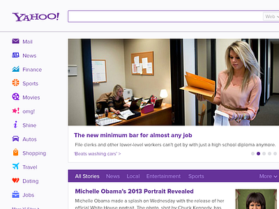
Yahoo Redesign Reconstructed
Steve Hickey
for
Fresh Tilled Soil
Available for work
Follow
Following
Like
Get in touch
#FAFAFB
#161211
#CBB6A8
#6B3DA0
#5B4F3D
#A9A195
#AF8F69
#A56942
Download color palette
I took a stab at fixing the visual problems I found with Yahoo!'s recent redesign.
reconstruction
redesign
redux
yahoo
View all tags
Posted on Feb 22, 2013
1,186
2
21
5
View feedback
Fresh Tilled Soil
Welcome to our design portfolio on Dribbble
More by Fresh Tilled Soil
View profile
Previous
Next
Loading…
Loading…