Looks neat. I really like the styling of the controls.
I just noted a few things (I'm kinda a form-nerd... if that even exists):
- The Paypal / Credit card should be a radio instead of a check (you can only choose one of them).
- I also think (and maybe this is a bit more subjective) that the lecture's kinda weird with the 2 columns.
About the check, must definitely be a radio. About the 2 columns credit card form, I think I've seen it before. Anyway the developers may have changed it already since this is my .psd :)
7 Responses
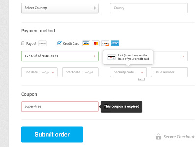
Almost done all the Photoshop work, the team is now working on the code.
Check out the @2x version!
Follow all the updates on the Medialoot re-design process (plus tons of free resources are coming soon) on @medialoot!
4 months ago
Looks great, well done!
4 months ago
Thanks Robbert!
4 months ago
Looks neat. I really like the styling of the controls.
I just noted a few things (I'm kinda a form-nerd... if that even exists):
- The Paypal / Credit card should be a radio instead of a check (you can only choose one of them).
- I also think (and maybe this is a bit more subjective) that the lecture's kinda weird with the 2 columns.
Hope it'll help you :).
Great job!
4 months ago
Thanks for the tips @Emiliano Quintana
About the check, must definitely be a radio. About the 2 columns credit card form, I think I've seen it before. Anyway the developers may have changed it already since this is my .psd :)
4 months ago
That's a lovely form. Especially the way you've created such a clean feel to a very busy page. Excellent work :-)
4 months ago
Thanks @Seb Kay ;)
4 months ago