Boston Revolution v2

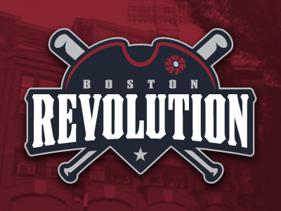
Refined the tri-corn hat portion of the logo, and switched around a few color combinations to make the "Revolution" text stand out a bit more.
Refined the tri-corn hat portion of the logo, and switched around a few color combinations to make the "Revolution" text stand out a bit more.


