Find designers
Designer search
Quickly find your next designer
Post a job
The #1 job board for design talent
Inspiration
Courses
UX Diploma
Learn UX design from scratch in 6 months
UI Certificate
12-week UI skill building for designers
Live interactive workshops
with design professionals
Jobs
Go Pro
Log in
Dribbble: the community for graphic design
Log in
Sign up
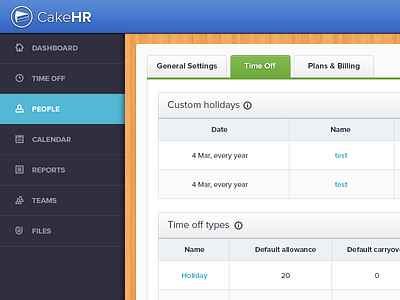
HR App Interface
Ionut Zamfir
Available for work
Follow
Following
Like
Get in touch
#F8F8F9
#2F2E3E
#3F70C6
#5A9EB8
#EEA65A
#9FA3AF
#3F4555
#B5AB52
Download color palette
Don't forget to check the @2x version for real pixels.
app
cake
cake hr
colourful
dashboard
hr
interface
psd
table
View all tags
Posted on Feb 21, 2013
16,910
56
255
30
View feedback
Ionut Zamfir
Freelance designer with a huge passion for clean interfaces.
Get in touch
More by Ionut Zamfir
View profile
Previous
Next
Loading…
Loading…
Loading…