Find designers
Designer search
Quickly find your next designer
Post a job
The #1 job board for design talent
Inspiration
Courses
UX Diploma
Learn UX design from scratch in 6 months
UI Certificate
12-week UI skill building for designers
Live interactive workshops
with design professionals
Jobs
Go Pro
Log in
Dribbble: the community for graphic design
Log in
Sign up
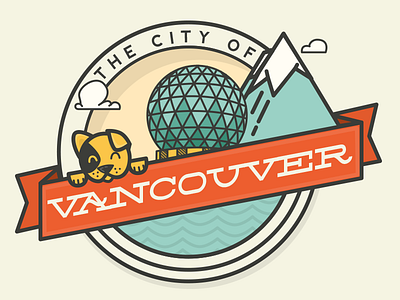
City of Vancouver
Meg
Follow
Following
Like
#F5F4E2
#3C3D39
#EB6033
#B9D2BC
#60A796
#ECB94F
Download color palette
First round, looking for some feedback :)
badge
banner
city
cloud
dog
mountain
puppy
science
science centre pup
vancouver
waves
View all tags
Posted on Feb 20, 2013
8,695
28
261
16
View feedback
Meg
More by Meg
View profile
Previous
Next
Loading…