Find designers
Designer search
Quickly find your next designer
Post a job
The #1 job board for design talent
Inspiration
Courses
UX Diploma
Learn UX design from scratch in 6 months
UI Certificate
12-week UI skill building for designers
Live interactive workshops
with design professionals
Jobs
Go Pro
Log in
Dribbble: the community for graphic design
Advance your career with a Professional Diploma in UX Design
Learn more
Log in
Sign up
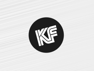
KF Wordmark
Kyle Fox
Follow
Following
Like
#EEEEEE
#1C1C1C
#9E9E9E
#5C5C5C
Download color palette
Dotty wordmark/logo for my revamp of
kylefox.ca
.
(seriously, it's coming...)
black white
dot
logo
wordmark
View all tags
Posted on Jan 3, 2011
1,414
0
7
5
View feedback
Kyle Fox
More by Kyle Fox
View profile
Previous
Next
Loading…