Find designers
Designer search
Quickly find your next designer
Post a job
The #1 job board for design talent
Inspiration
Courses
UX Diploma
Learn UX design from scratch in 6 months
UI Certificate
12-week UI skill building for designers
Live interactive workshops
with design professionals
Jobs
Go Pro
Log in
Dribbble: the community for graphic design
Log in
Sign up
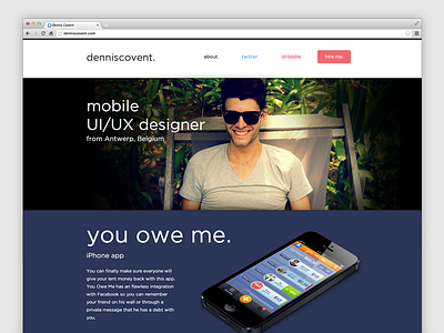
New portfolio ✔ denniscovent.com
Dennis Covent
Follow
Following
Like
#2C3657
#EBECEB
#090C0D
#C2BBA8
#585A48
#6B8098
#BB9965
#AA6F57
Download color palette
New portfolio ✔
denniscovent.com
Thoughts?
covent
dennis
parallax
portfolio
responsive
website
View all tags
Posted on Feb 20, 2013
2,447
3
87
20
View feedback
Dennis Covent
More by Dennis Covent
View profile
Previous
Next
Loading…