Nice. I think the header image should span the whole width though (at least have a background); it looks a bit weird with the background on one side and nothing on the other.
@Jordan Sowers If you customize too many things the user might get annoyed (if they want to customize something they can do it themselves, especially with scroll bars and input elements).
21 Responses
Pro
Bill S Kenney
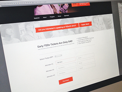
Just working out some tweaks for the new local TEDx website.
Created with the Focus Lab team
3 months ago
Nice Bill. Usual awesome cleanness here. Not much to critique.
3 months ago
Pro
Mike Busby
Lovely and clean! what font is used for the heading "Early TEDx .... etc"
3 months ago
Pro
Damian Watracz
I like it! Nice red color.
3 months ago
Pro
Eduardo Santos
Damn. That typeface!
3 months ago
Pro
Mirco Moretti
welcome back @Bill …oh! oh! TEDx-plotion… ^.^
3 months ago
Nice. I think the header image should span the whole width though (at least have a background); it looks a bit weird with the background on one side and nothing on the other.
3 months ago
Pro
Jordan Sowers
Looks awesome! I think it could use a custom select box.
3 months ago
@Jordan Sowers If you customize too many things the user might get annoyed (if they want to customize something they can do it themselves, especially with scroll bars and input elements).
3 months ago
Pro
Garrett Godsey
looks good man. nice and clean.
3 months ago
Pro
Dennis Terrey
@Noah Buscher @Mike Busby looks more like museo.
3 months ago
Pro
Luke Etheridge
@2x?? o_o
YES @Bill S Kenney!
3 months ago
Looking great!
3 months ago
Pro
Nigel Evans
Really like how this is shaping up :)
3 months ago
nice work :)
3 months ago
Pro
Stanislav Hristov
Nice work!
3 months ago
Pro
Nuruzzaman Sheikh
Great work! And I'm going to love TEDx twice from now :P
3 months ago
Pro
Tim Green
Very clean, can't wait to see it in action!
3 months ago
@Dennis Terrey Yes, definitely more like Museo
3 months ago
Pro
Bill S Kenney
Yeah it is Museo :) @Dennis Terrey @Matthew Ferry @Noah Buscher @Mike Busby
3 months ago
The "apply here" banner is inspired. And the use of Museo is such a nice break from the expected. Really great work man.
3 months ago