P-Ops About

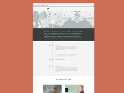

Product Ops about page. The icons in the header at the moment are placeholders. Not sure yet if that idea is going to stick. Collab with @Craig Stubberfield
Product Ops about page. The icons in the header at the moment are placeholders. Not sure yet if that idea is going to stick. Collab with @Craig Stubberfield


