Task ll

Sorry folk, the previous shot was not working for me.
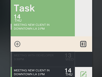
This is the 2nd screen for this app. Still early stages. This view show a hyper view so not everything you see here will be displayed and icons may need to be polished. This still need to go thru lots of iteration.
All critics and feedback are welcome!
See real pixels attached - you can also see this shot @2x if you choose. :)


