Find designers
Designer search
Quickly find your next designer
Post a job
The #1 job board for design talent
Inspiration
Courses
UX Diploma
Learn UX design from scratch in 6 months
UI Certificate
12-week UI skill building for designers
Live interactive workshops
with design professionals
Jobs
Go Pro
Log in
Dribbble: the community for graphic design
Log in
Sign up
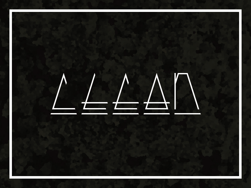
Clean (gif)
Manuel Krüger
Follow
Following
Like
#11110E
#FEFEFE
#403D39
#C3C1BF
#A5A2A0
#615E5B
Download color palette
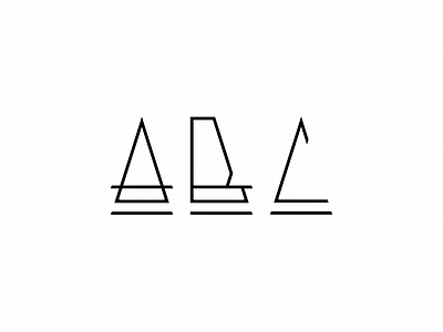
Please say which one is better.
Rebound of
ABC #3
By
Manuel Krüger
abc
alphabet
black
clean
font
krueger
krüger
manuel
typeface
wip
View all tags
Posted on Feb 17, 2013
762
0
16
5
View feedback
Manuel Krüger
More by Manuel Krüger
View profile
Previous
Next
Loading…