Nice little sample. Would love to see more. I like how you have the 100% slightly transparent. It kind of reinforces how the organization is being with the money.
I do feel like the alignment is off though. It could be that the header and logo or full justified and you have the copy w/ a right rag so it's giving the illusion that it's not aligned properly. The other issue I have with this piece which may be out of your control is the body copy. I feel like the message could be crafted with the same meaning but in a more elegant way. When reading this, the way the type is laid out you get "your community" on top of each other for three straight lines.
4 Responses
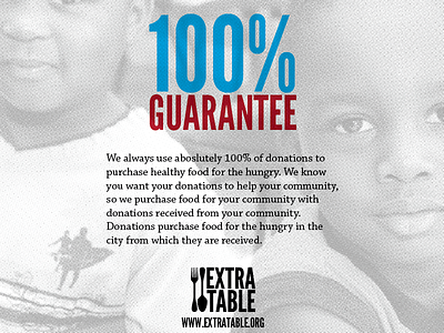
Sample shot from part of a new brochure for a local non-profit, Extra Table.
4 months ago
Nice little sample. Would love to see more. I like how you have the 100% slightly transparent. It kind of reinforces how the organization is being with the money.
I do feel like the alignment is off though. It could be that the header and logo or full justified and you have the copy w/ a right rag so it's giving the illusion that it's not aligned properly. The other issue I have with this piece which may be out of your control is the body copy. I feel like the message could be crafted with the same meaning but in a more elegant way. When reading this, the way the type is laid out you get "your community" on top of each other for three straight lines.
4 months ago
Thanks, Danny. I'll work with the alignment and see if I can't work with the copy a bit. I appreciate the feedback.
4 months ago
Rebound
Cover WIP
by Paul Tynes
Still working on it but this is the general idea. I would love some feedback.
4 months ago