Haze UI

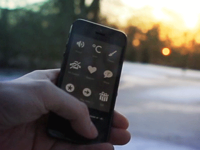
Here's another quick animation of the Haze UI in action. Simple screenshots doesn't really do the fluidity of the app we worked so hard for justice, hopefully you'll get an idea of it here.
Head over to gethaze.com and see the video i put together there.
We're running an Introductory price at 60% off, so now might be a good time to check it out.
___
Get My Industry Standard Design Resources
at 📐👉 applypixels.com
Premium Evolving Icon & UI templates (& a bunch of freebies)


