Find designers
Designer search
Quickly find your next designer
Post a job
The #1 job board for design talent
Inspiration
Courses
UX Diploma
Learn UX design from scratch in 6 months
UI Certificate
12-week UI skill building for designers
Live interactive workshops
with design professionals
Jobs
Go Pro
Log in
Dribbble: the community for graphic design
Advance your career with a Professional Diploma in UX Design
Learn more
Log in
Sign up
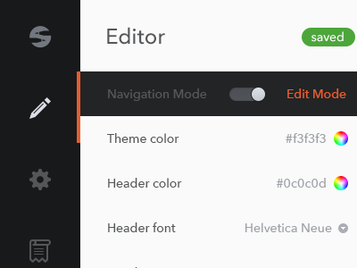
scms_v3
Fares Farhan
Available for work
Follow
Following
Like
Get in touch
#F9FAFA
#1C1D1E
#535558
#A2A4A7
#BCC8BE
#63A259
#DA552E
#4F3C38
Download color palette
flat
icons
lj system
navbar
sidebar
smartcms
switch
View all tags
Posted on Feb 15, 2013
10,355
30
154
12
View feedback
Fares Farhan
Human Interface Designer
Get in touch
More by Fares Farhan
View profile
Previous
Next
Loading…
Loading…
Loading…